Artist research (2) nick knight
Nick Knight is one of the world’s most influential fashion photographers. He was born in London in 1958 and studied photography. He graduated in 1982. Nick has created editorial work for Vogue, Dazed & Confused, W Magazine, i-D, and Visionaire. He has also produced fashion and advertising projects for clients such as Christian Dior, Alexander McQueen, Calvin Klein, Levi Strauss, Yohji Yamamoto and Yves Saint Laurent. He has received many awards throughout these projects.
Nick Knight is the director & founder of SHOWstudio.com (founded in 2002 to pioneer live media and fashion film). SHOWstudio consists of many contributors and artists, one of which I was really inspired by to create my final design - Matthew Williams (NEXT PAGE - INDEPENDENT ARTIST RESEARCH 3).
As a fashion photographer, Nick Knight has constantly challenged predictable ideas of beauty. His work has been shown at institutions like the V&A Museum, Saatchi Gallery, the Photographers Gallery and Hayward Gallery and most recent, The Tate Modern.
From observing his work, I believe that Nick Knight has gone beyond photography. He has created a shift in the definition of photography with the use of digital media and different mediums.
Analysing nick knight's work

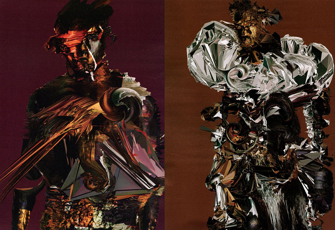
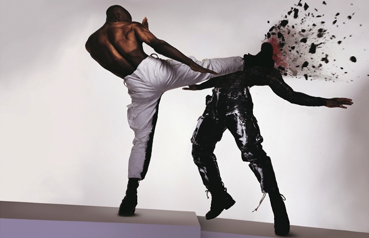
In the image above, Nick Knight has highly digitally manipulated a photograph of rapper/fashion designer Kanye West. I believe that this design is for fashion purposes. I think it is trying to portray one of Kanye West's huge ventures - fashion. Nick Knight has used multiple colours and shapes to give the image more of a abstract feel. The image is much exaggerated and changes the mood of the artist. The artist has manipulated this image to give texture and pattern which sets the artist apart from others by going above the standard ideas of art and creativity. The use of triangular shapes creates a sharp effect to the image and gives a shattered feeling when looking at the image. I believe that he has used digital media such as Photoshop or After effects in order to manipulate a photograph of the rapper. He has used these mediums to almost make him look robotic/metalic (as if he is transforming) whilst also looking like a glitch. I think that he has used a brown background to contrast the main image and make it stand out. The brown background is used as a contrast while also relating back to the actual image as some parts of it are brown.

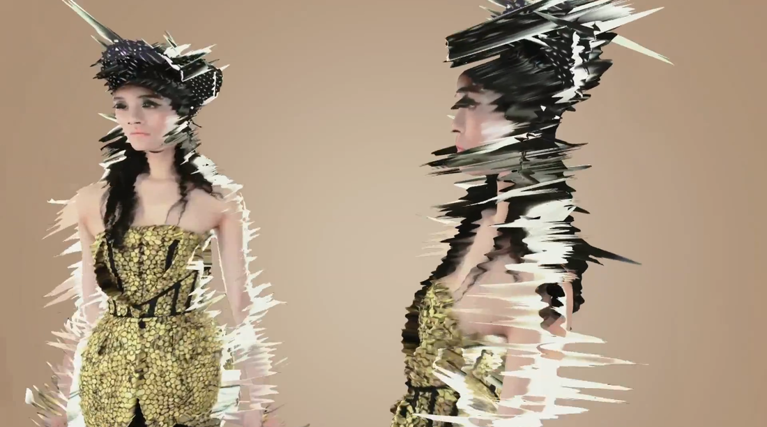
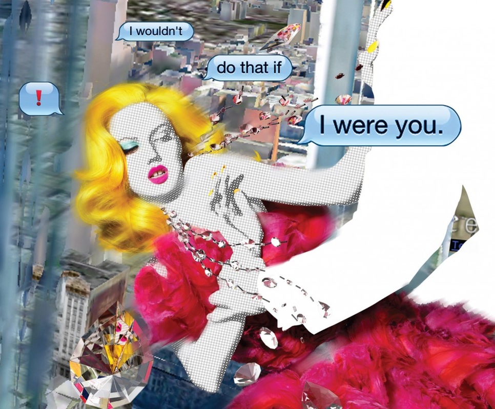
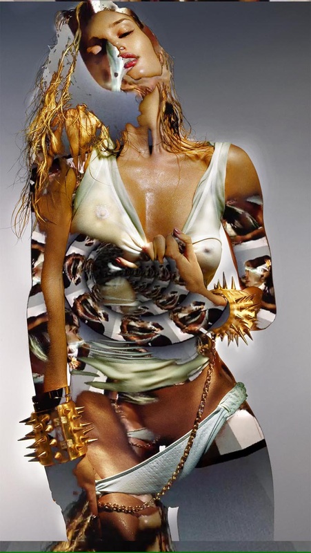
In this image, Nick Knight has created a mixed media piece by combining photography with pop art and digital manipulation. I think that this image could be used for fashion purposes due to the females dress and jewellery being portrayed. The image has a good variety of colours and shapes. Its more realistic than the others because it has not really been distorted. The usage of text helps set the tone for the image. By seeing how the females body is positioned and the jewelry that seems to be coming off her neck, it is obvious that the text demonstrates what is happening in the photo. She is being pushed which creates a unsafe feeling and curiosity when looking at the image. The background is distant and blurred a bit which gives the forefront image a chance to standout more. I believe the vibrant yellow and pink colours used on the female enhances the overall image and gives it a pop art feel when viewing it.

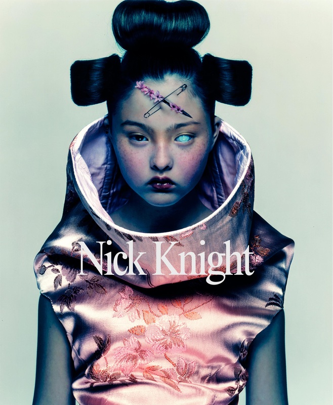
The artist has manipulated this photo by distorting the original image to create a more eccentric feel. I believe that this image is for fashion purposes. The different shapes and colours give an abstract look to the image which is what makes this photograph come to life. Distorting an image is recreating and providing your own signature to a piece of art whether it is a photograph, a painting or a drawing. I believe that this image depicts the artist’s style very well. Nick Knight has also erased some parts of the hair. I believe that he has purposely erased it in this way to go with the distorted flow.
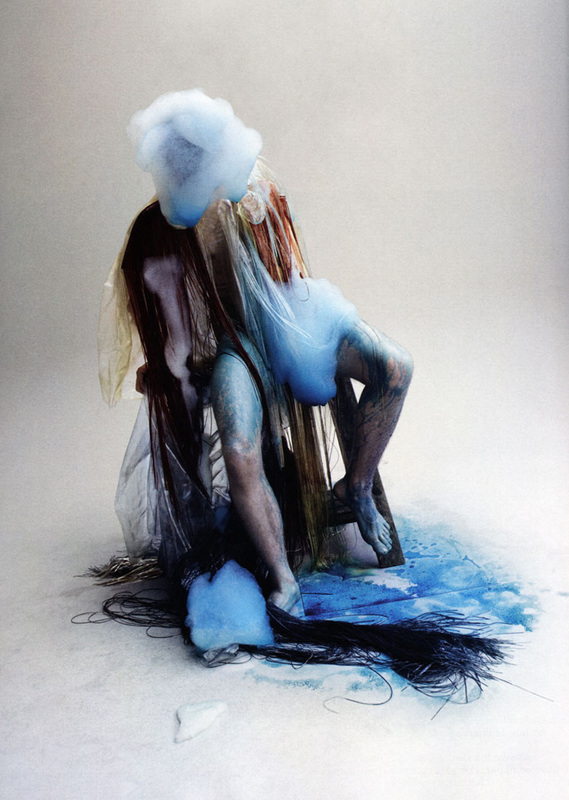
In this photograph there is a combination of realistic and unrealistic depictions. The usage of darker colours gives the image a depressed feeling. The texture that has been given makes the image stand out incredibly. By mixing different colours and textures, it allows the photograph to capture the mood. The background helps this immensely by giving the blue and brown colours a pop out feel. I believe that the paint on the ground was natural whereas the rest (eg. blue paint on legs and face) has been edited in Photoshop.
MY RESPONSE TO NICK KNIGHT
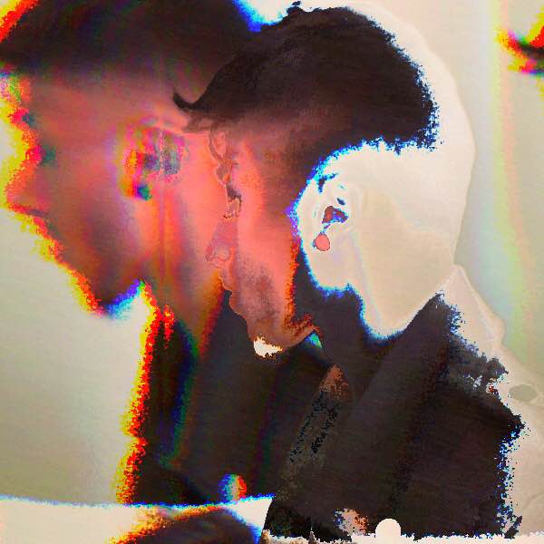
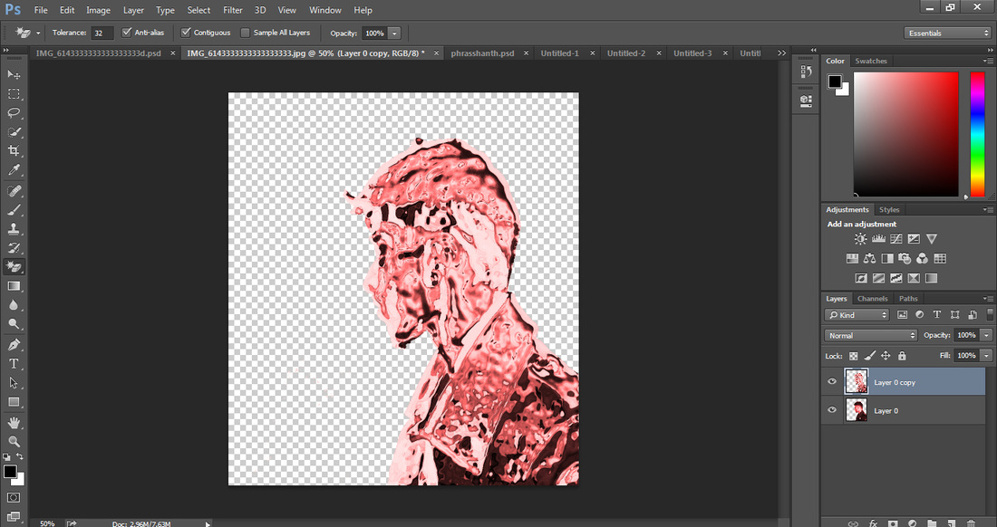
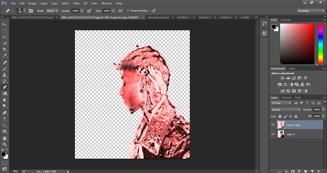
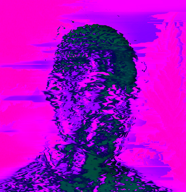
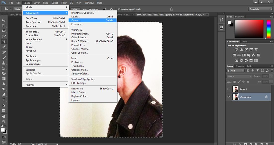
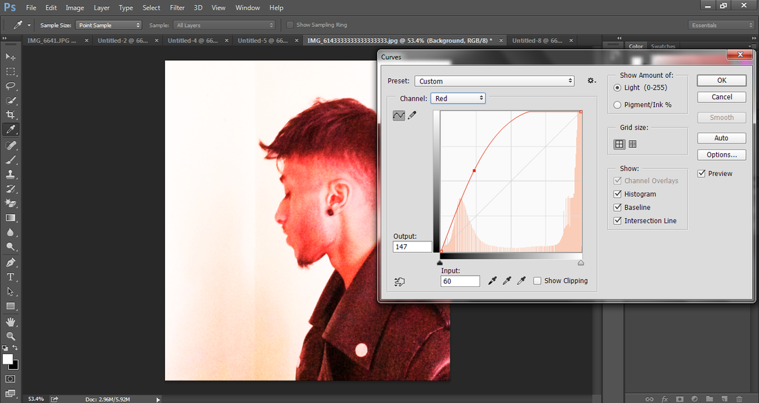
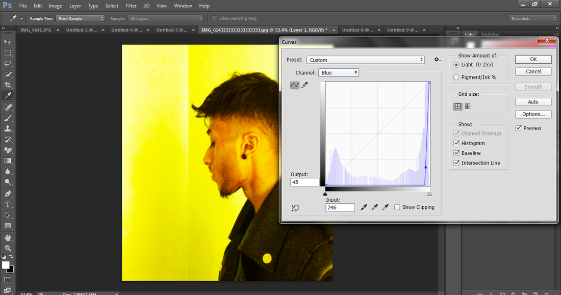
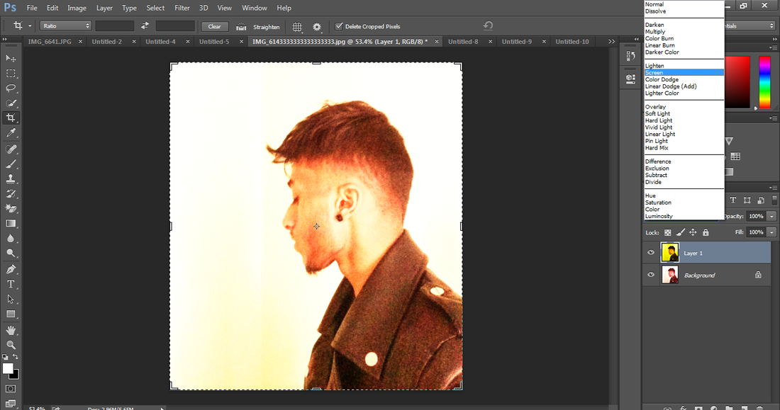
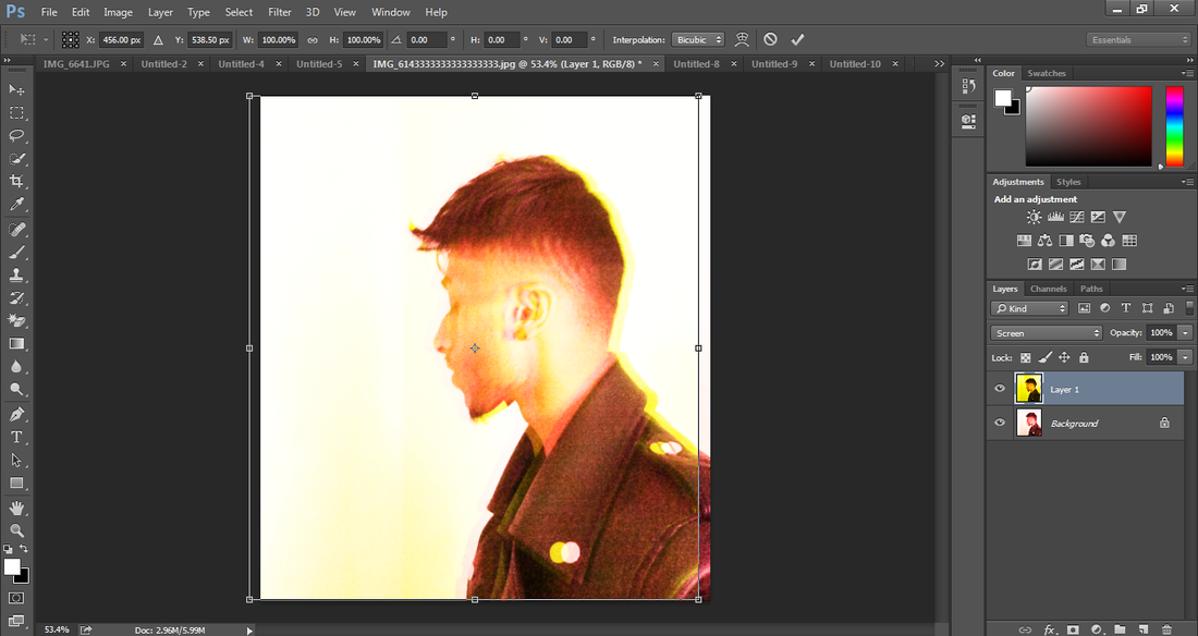
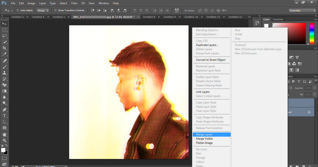
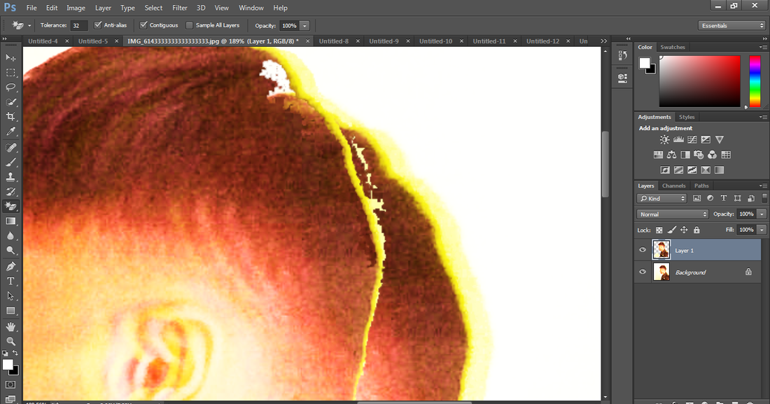
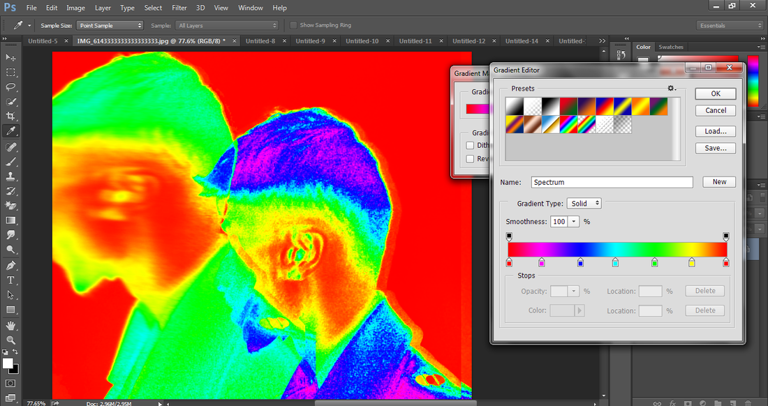
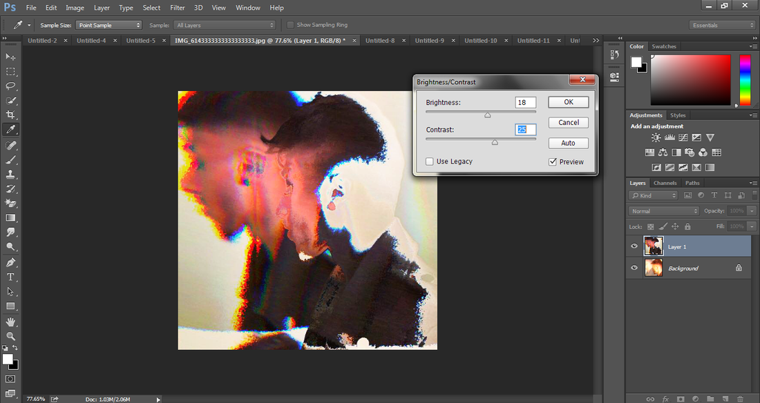
1) This is my first experimental design inspired by Nick Knight. The aim of this designs as well as the following Nick Knight inspired designs where to make them look distorted. In my first design, I have purposely tried to make the design look low in resolution. This was because I found that Nick Knight has purposely made some of his designs look distorted and low quality-like. I think that he has done this in order to make his photographs look manipulated whilst also giving them a slight vintage feel. I have tried to achieve that feel to this photograph of me. I did this by giving it a 3D effect and creating a few 'dissolved' effects. This has allowed me to create a washed, faded and distorted image of myself. I created this design by duplicating the photo of me and adding a red overlay colour. I did this by going to image>adjustments>curves and selecting red. I made the other image of me (layer below) yellow by following those same steps. Then I went to layer options and changed it from Normal to 'Screen'. This combined both colours together, starting to make it look a little distorted. Then I merged those layers together and duplicated it again. I did this in order to merge that same photo of me into the background. I changed the opacity from 100% to 50%. I used the Magic Eraser Tool to create a few distortions. This made the image look like its dissolving away. Finally, I added a gradient map to add a few more colours to the image. This has enabled the photo to pop out a little more. (Click on print screens below) ... The last photo of that gallery was created by Nick Knight which inspired me to go for a design that looked distorted and low in resolution.
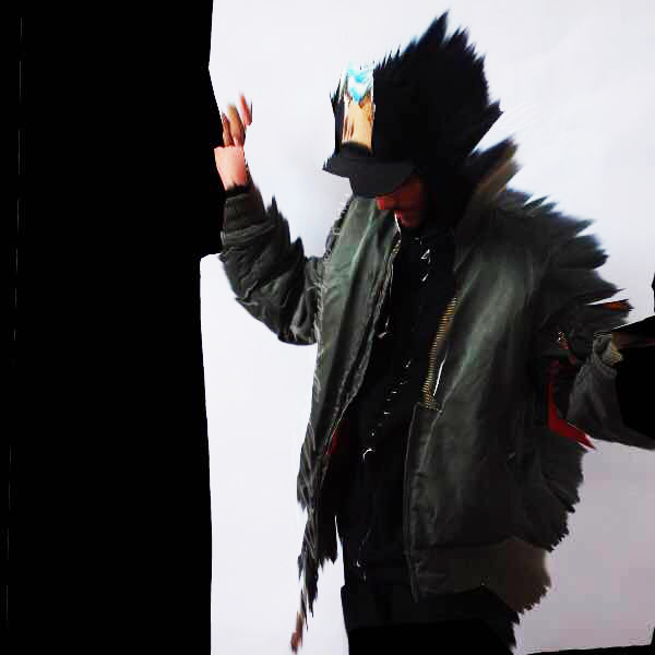

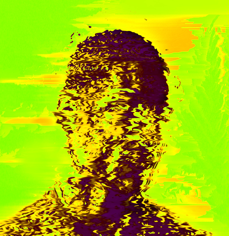
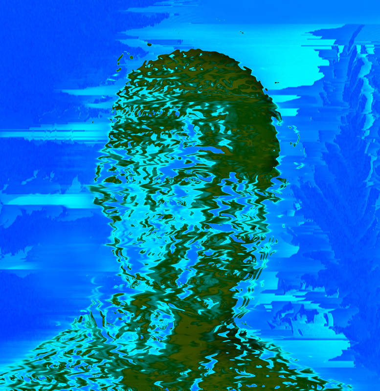
2) This is my second experimental design. This design was highly inspired by the image above created by Nick Knight.
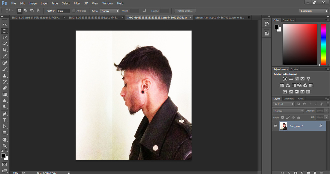
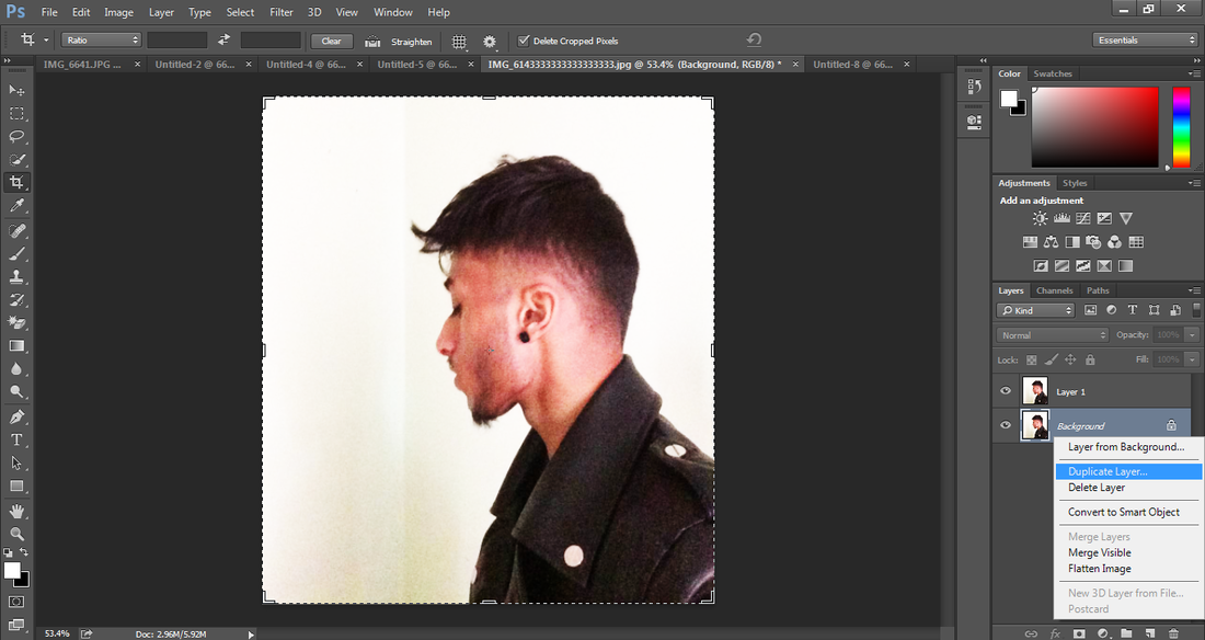
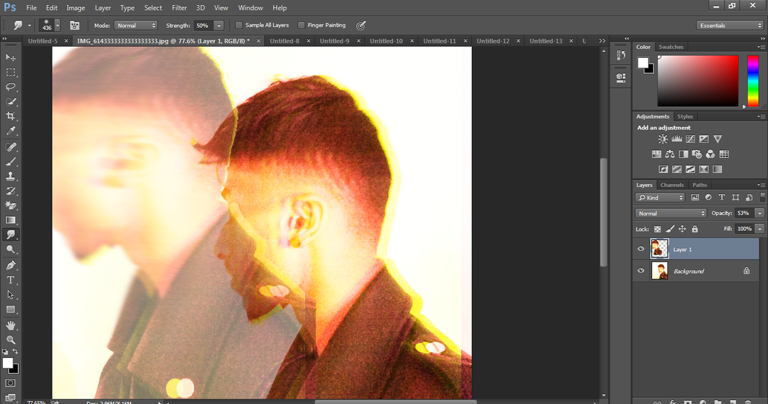
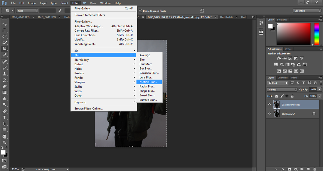
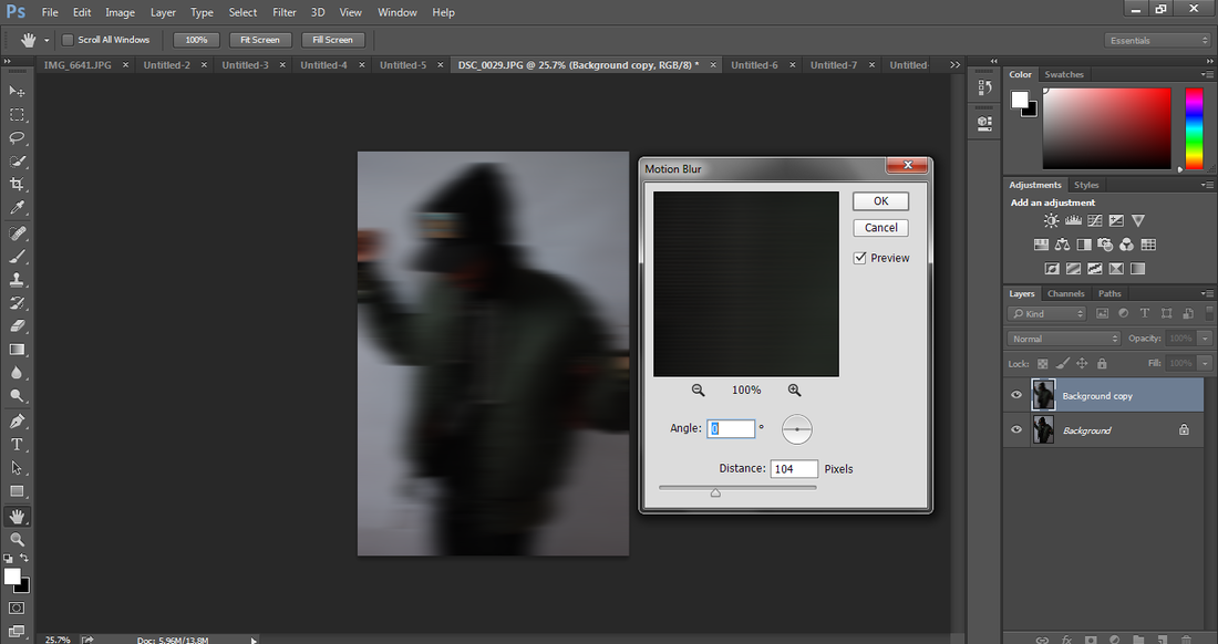
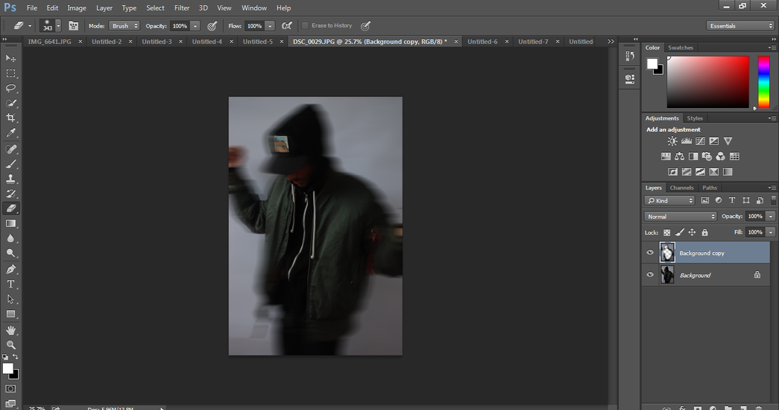
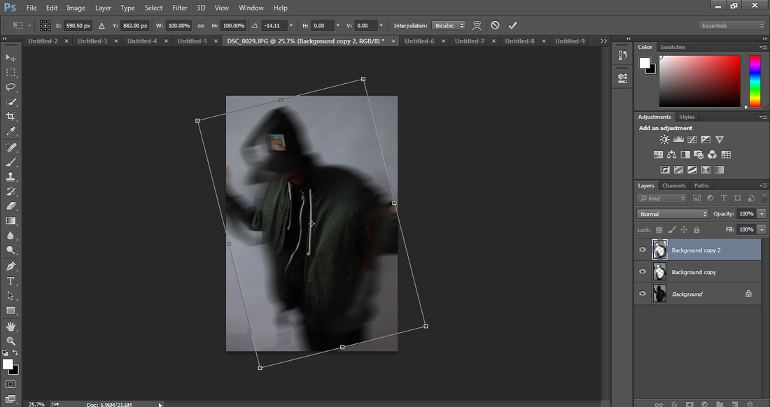
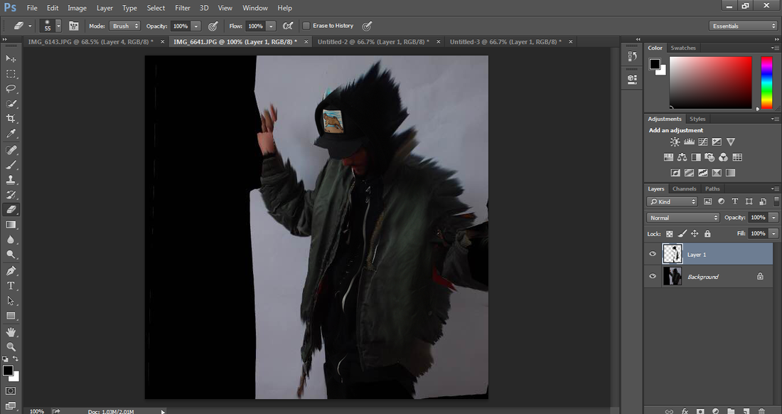
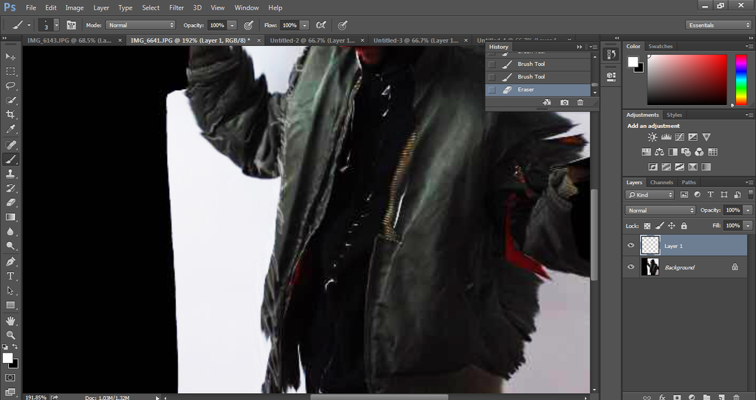
For this design, I have taken a photo of myself by using a Digital Single Lens Reflex Camera (DSLR). I took this photograph behind a white screen as this would make it easier to manipulate and edit it in Photoshop. I have created this design by duplicating the photo and adding a Motion Blur. I did this by going to Filter>blur>Motion Blur. Then I used the eraser to rub out some parts of the motion blur as I only wanted to keep the edges (reason why I duplicated the layer at the beginning). Then I duplicated the 'motion blur' layer and used the transformation tool to rotate it a little. I have used the smudge tool to make the edges come out a little bit more and make them sharper (like Nick Knight's design). Finally, I used the brush tool to create a few white strokes with my graphic tablet. I did this in order to bring more attention the the jacket and emphasise on the fashion. (Click on print screens below) .
For this design, I have taken a photo of myself by using a Digital Single Lens Reflex Camera (DSLR). I took this photograph behind a white screen as this would make it easier to manipulate and edit it in Photoshop. I have created this design by duplicating the photo and adding a Motion Blur. I did this by going to Filter>blur>Motion Blur. Then I used the eraser to rub out some parts of the motion blur as I only wanted to keep the edges (reason why I duplicated the layer at the beginning). Then I duplicated the 'motion blur' layer and used the transformation tool to rotate it a little. I have used the smudge tool to make the edges come out a little bit more and make them sharper (like Nick Knight's design). Finally, I used the brush tool to create a few white strokes with my graphic tablet. I did this in order to bring more attention the the jacket and emphasise on the fashion. (Click on print screens below) .

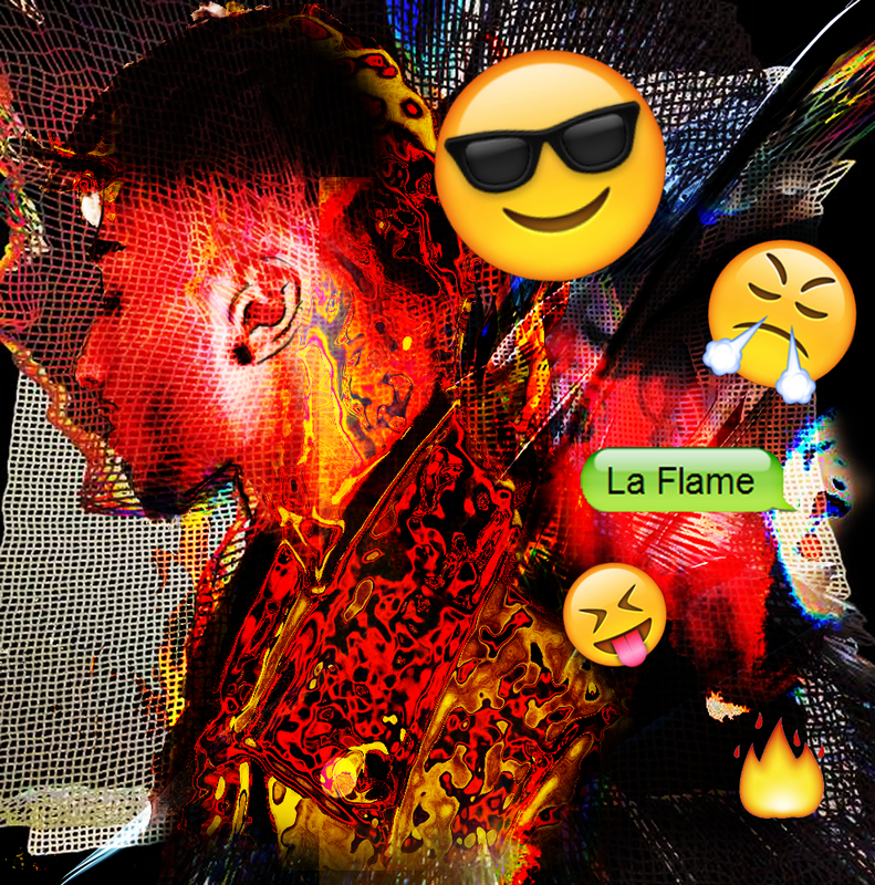
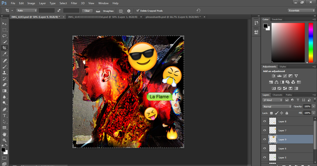
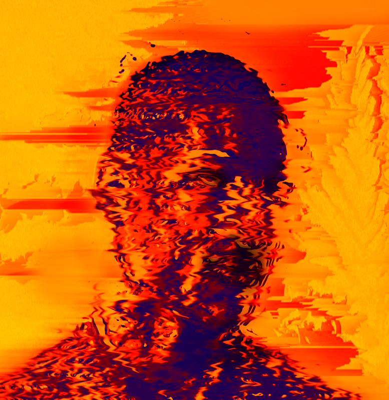
3) This is my third design inspired by Nick Knight. Prior to producing this design, I gathered a few images that I will need in order to create it...
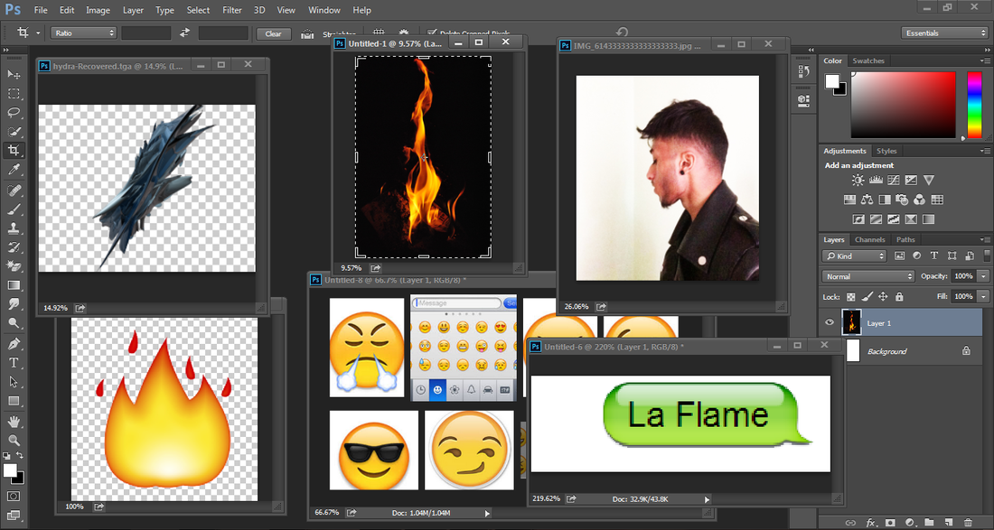
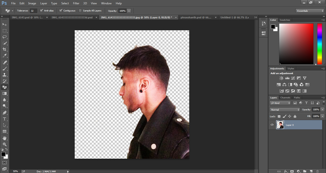
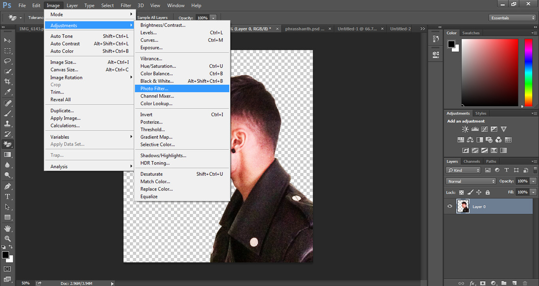
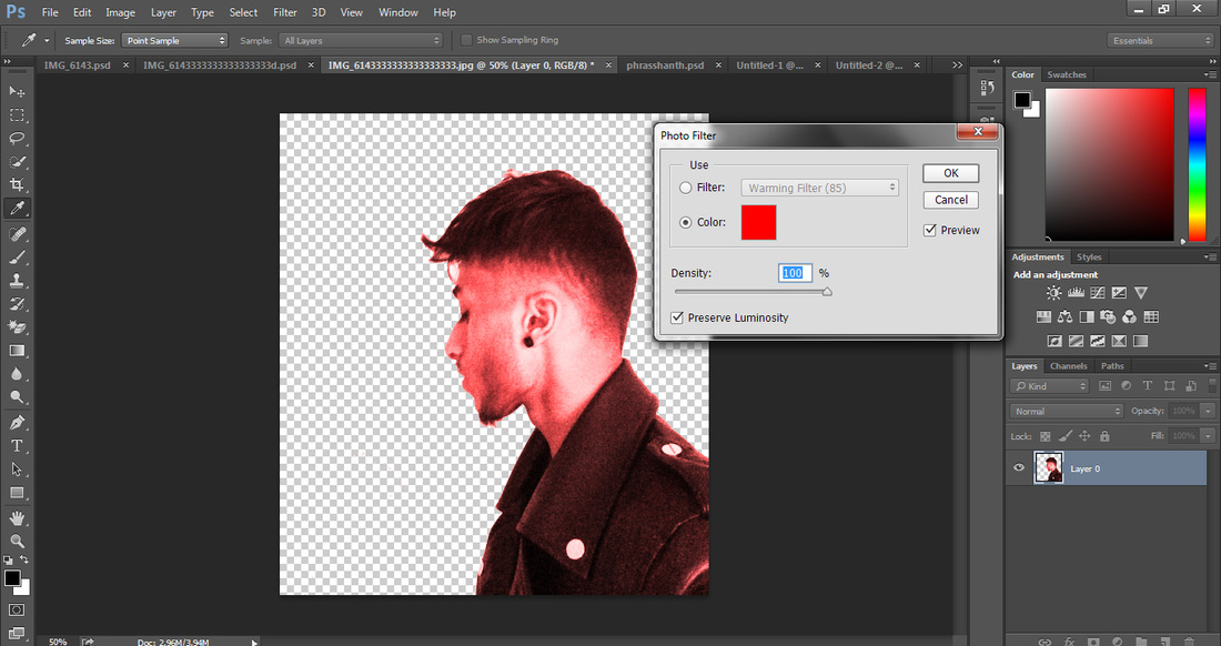
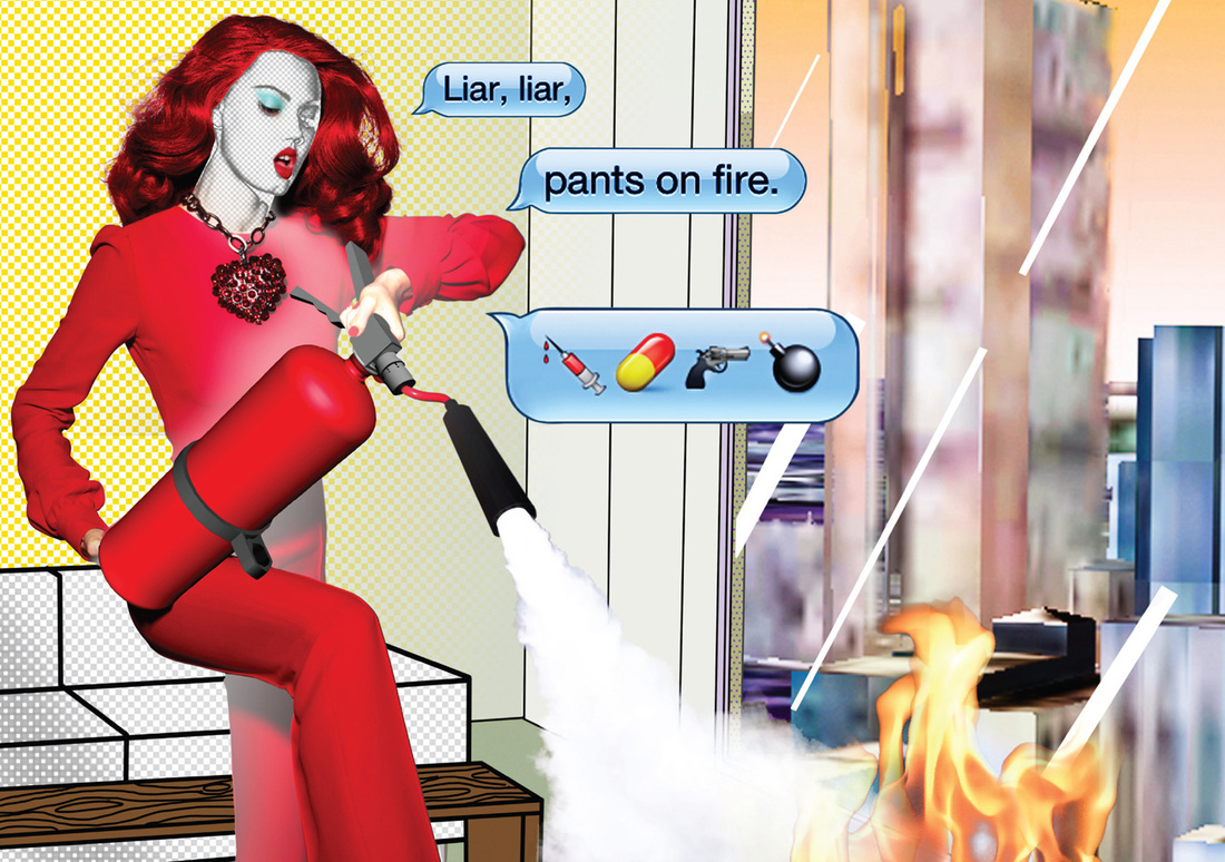
The theme that I tried to cover in this design was 'fire'. I have layered many shapes and patterns. I also used layer styles such as overlay and soft light to create this effect. I started off by removing the white background with the 'Magic Eraser Tool'. Then I went to Image>Adjustments>Photo Filter. This will allow me to add a colour over my photograph. I have chosen red. I duplicated the original layer and changed it to 'chrome' in filters. This gave a deeper depth to the image. I also made this red. Finally, I combined all the images shown above together